Service: Branding Client: R/GA × SCAD Timeline: 5 Weeks
Team
Morgan Portillo
Dakotah Myers
Isabelle Conrath
Spencer Wilcox
Kash Thomas
Morgan Portillo
Dakotah Myers
Isabelle Conrath
Spencer Wilcox
Kash Thomas
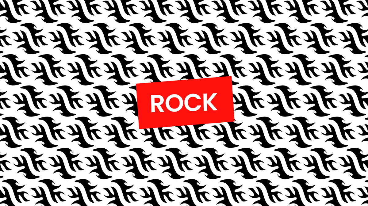
ITS MORE THAN JUST A MUSIC EVENT; IT'S A CULTURAL EXPERIENCE.
Rock in Rio, one of the world’s largest music festivals, has grown from a rock concert in the 1980s to a global, multi-genre event. As part of the SCAD Studio II course, our team collaborated with R/GA to reimagine the festivals identity for its 40th anniversary, aiming to attract a younger audience (ages 25–30), create a flexible system adaptable to multiple genres and collaborations, and ensure consistency across physical and digital platforms.
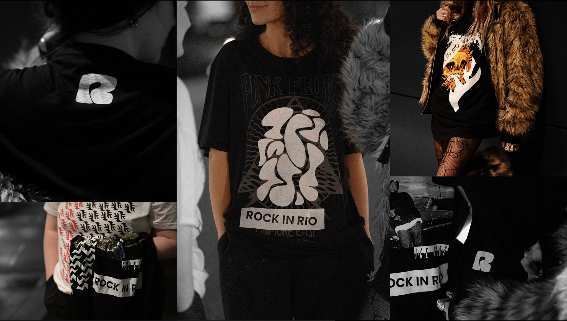
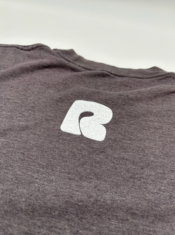
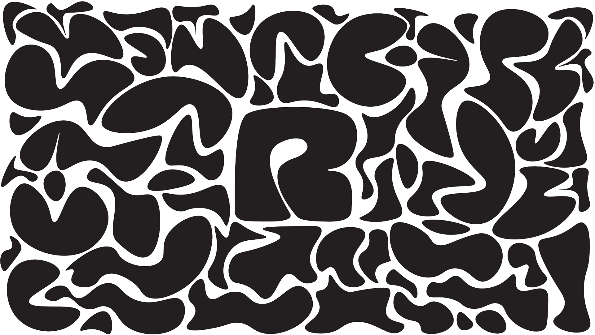
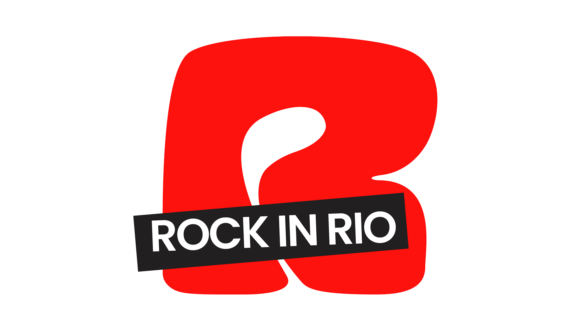
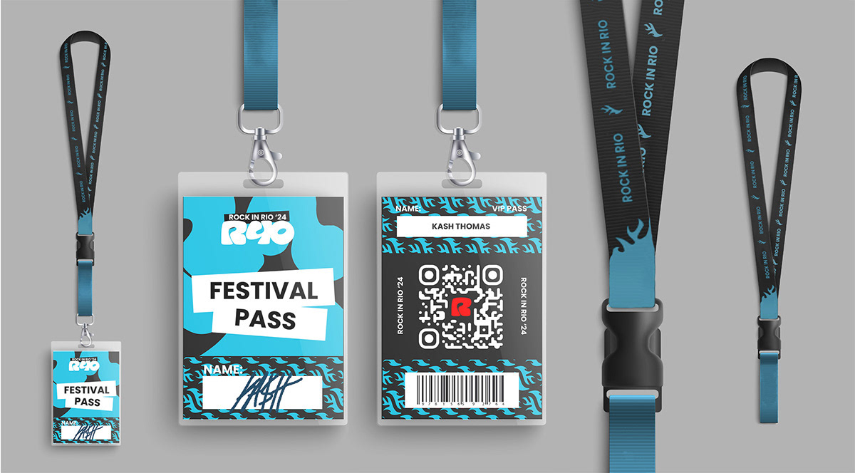
LOGO
A round, welcoming mark with an adaptable R counter that morphs into icons (Rap, Pop, Rock, Sustainability). Designed to scale across digital, physical, and environmental touchpoints.
COLOR
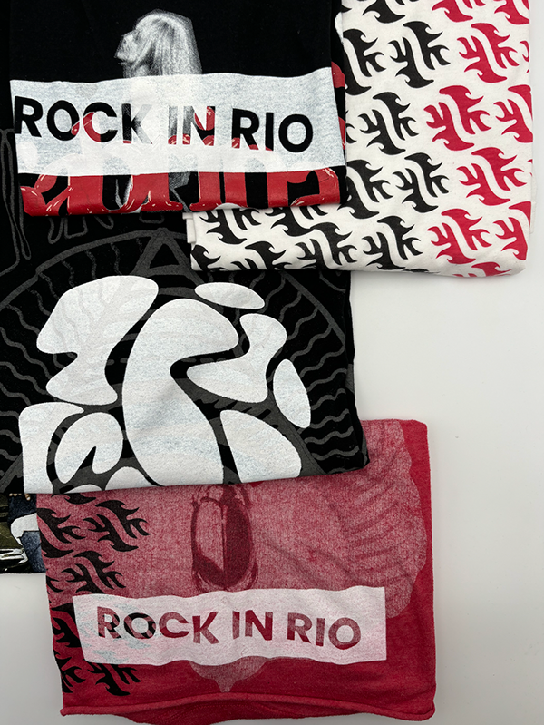
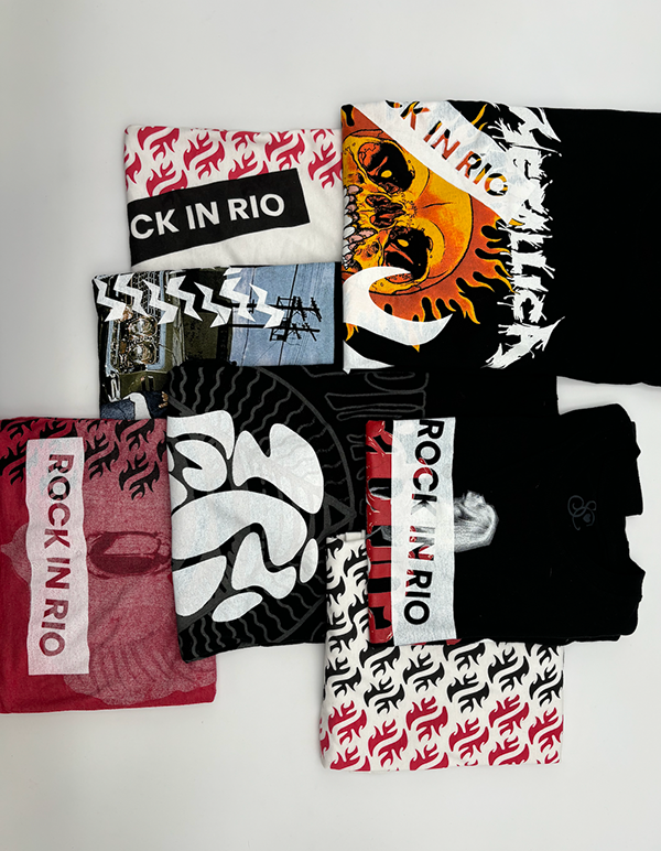
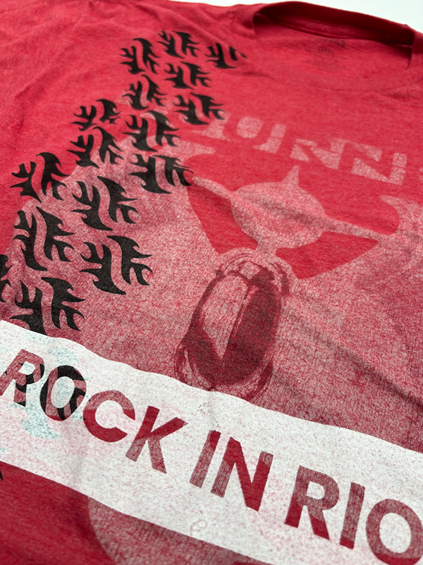
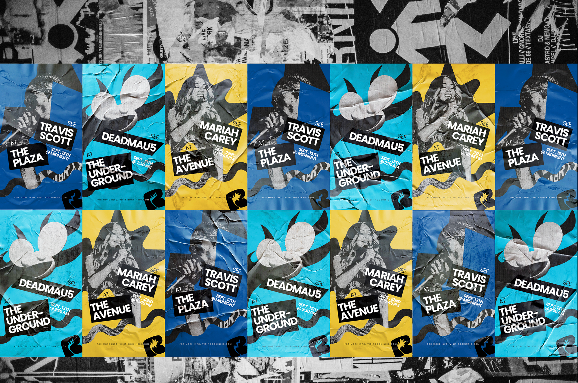
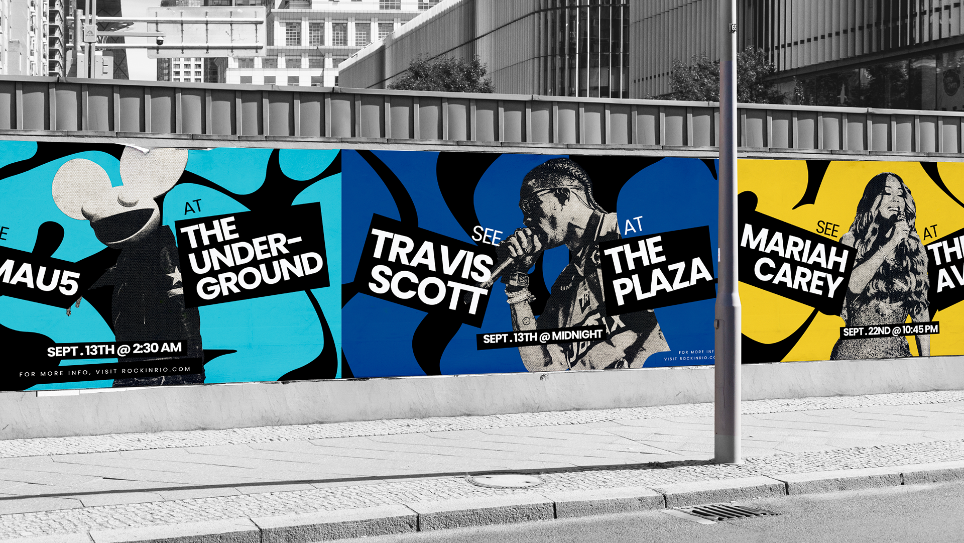
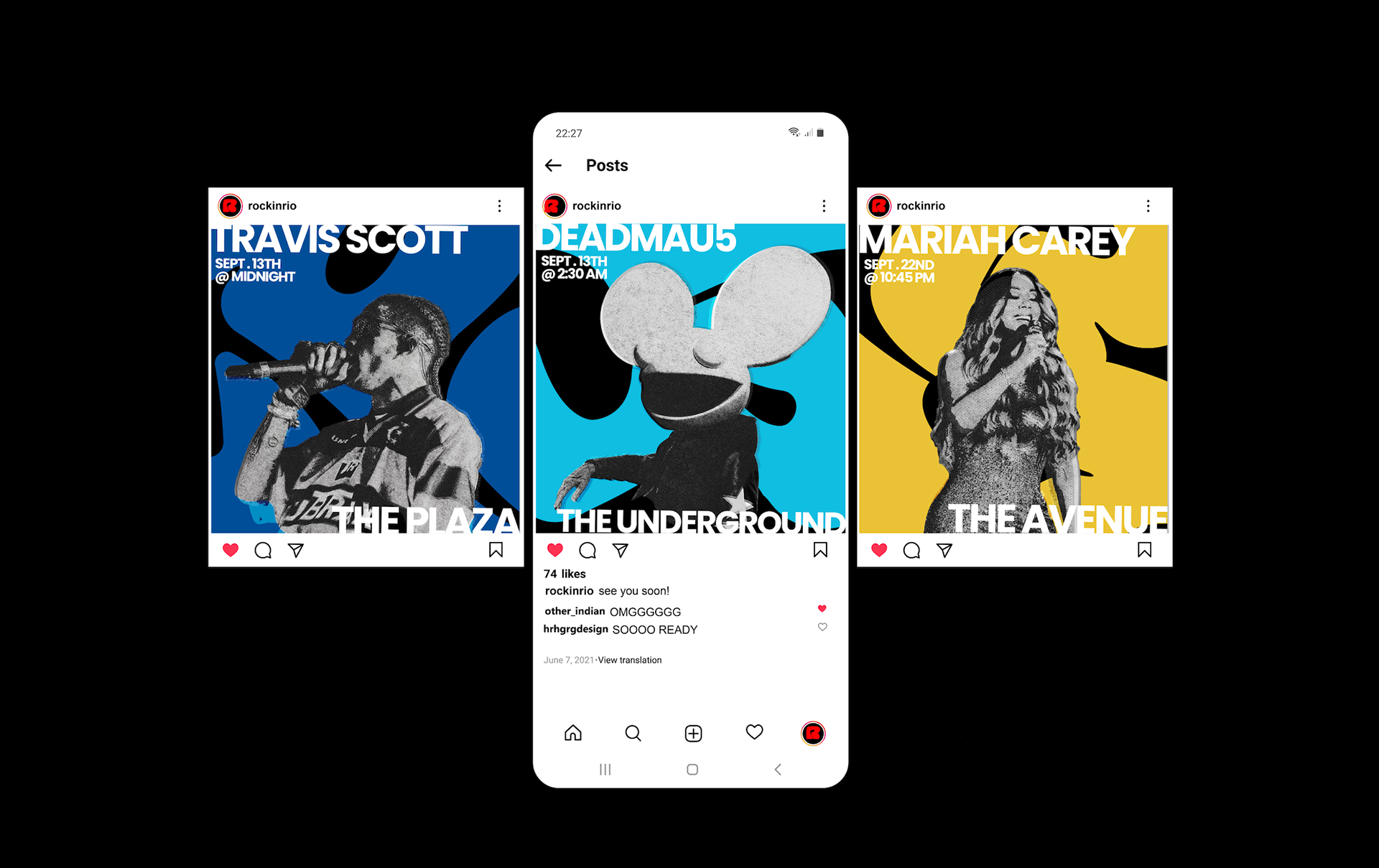
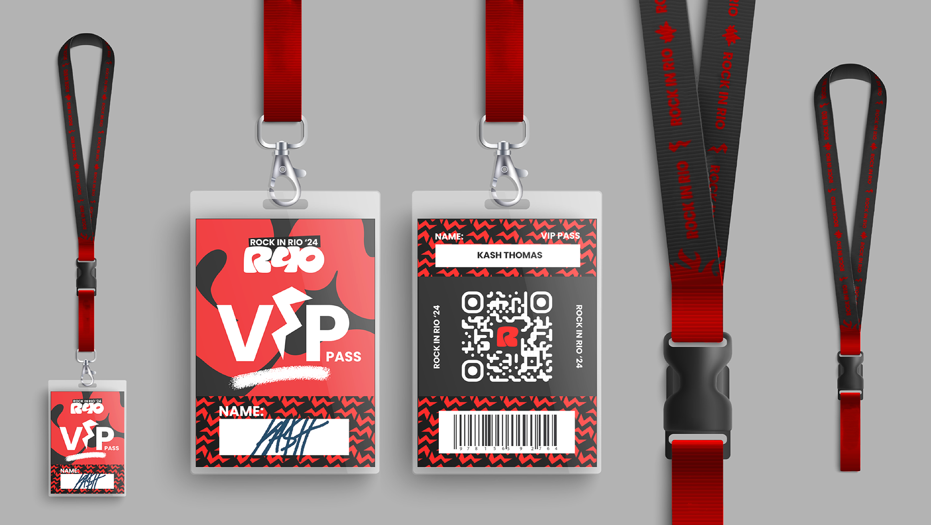
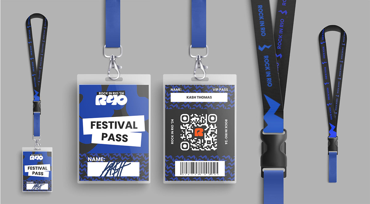
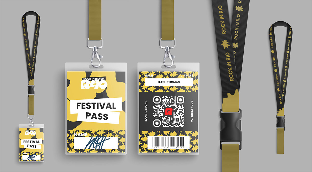
Primary: Red / Black / White
Secondary: Blue / Yellow / Teal for versatility.
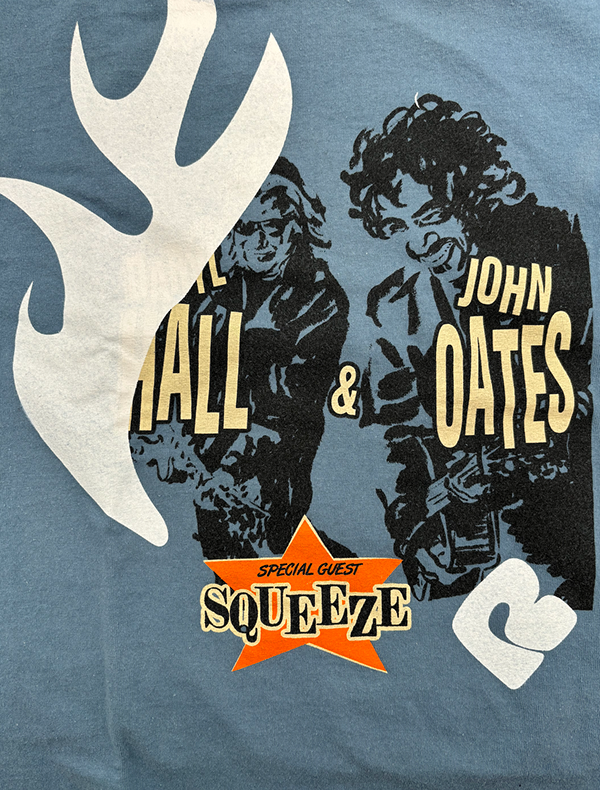
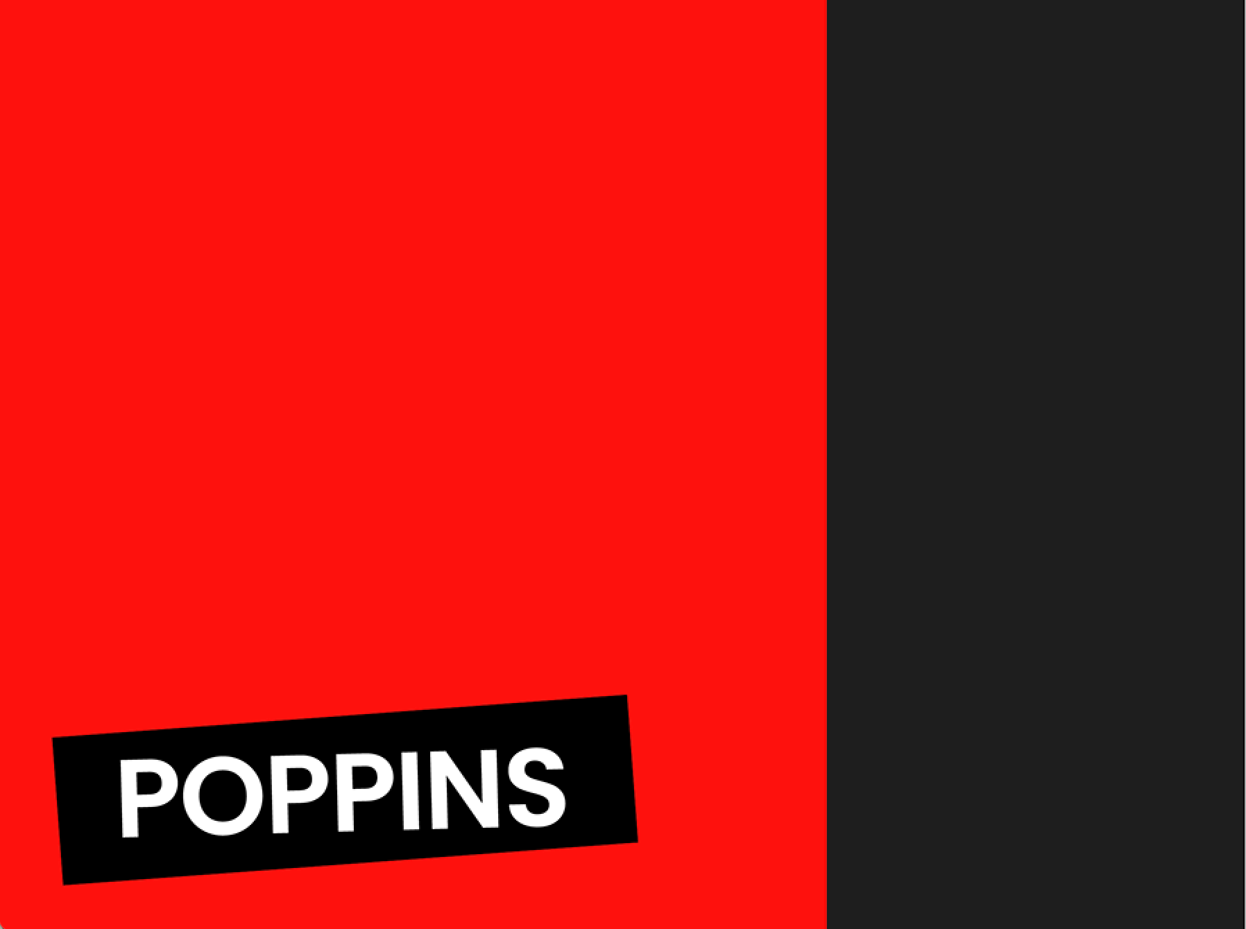
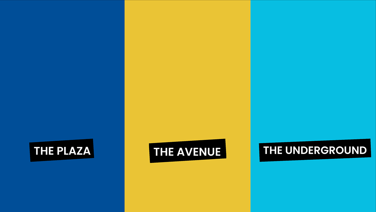
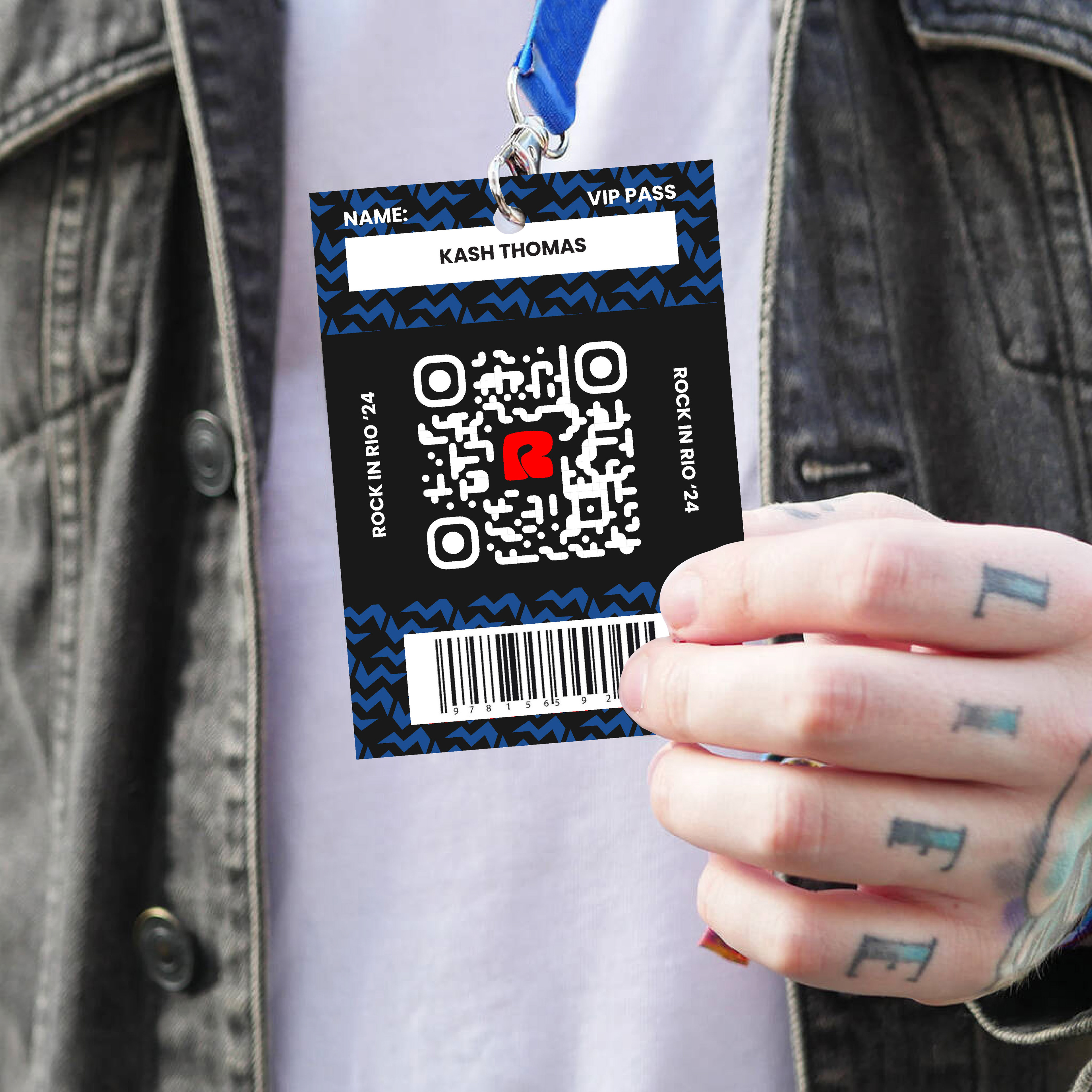
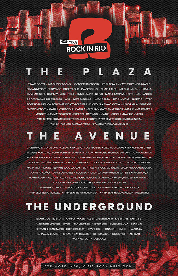
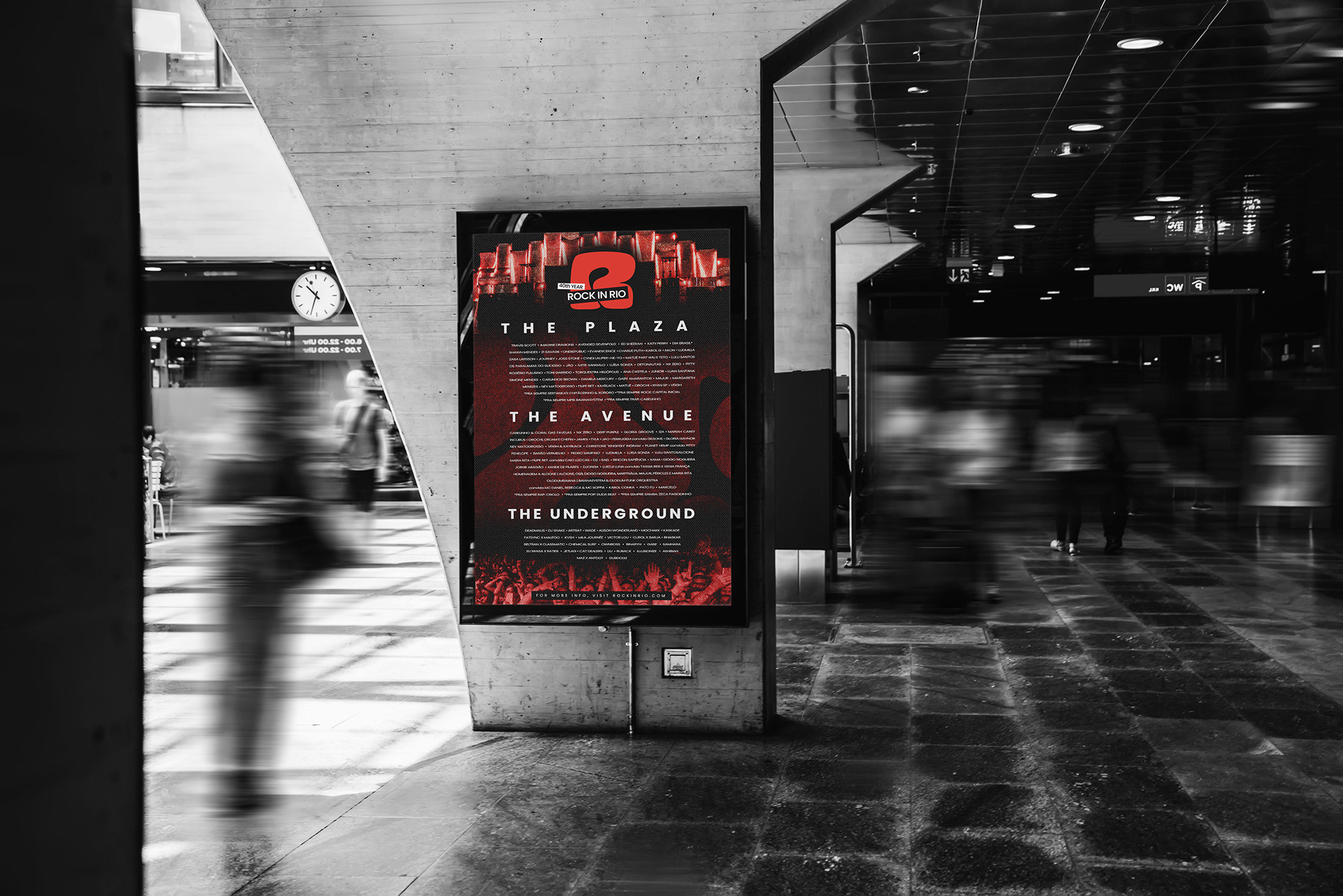
New stage names: The Plaza, The Avenue, The Underground Typography: Poppins logotype in an offset black frame
Secondary: Blue / Yellow / Teal for versatility.
New stage names: The Plaza, The Avenue, The Underground Typography: Poppins logotype in an offset black frame
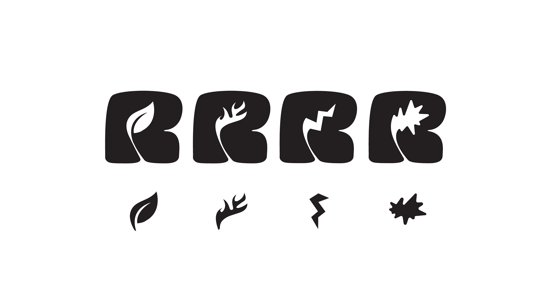
SYSTEM
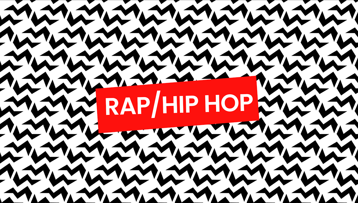
The counter of the “R” is the core of the system—a dynamic shape that transforms into icons for Rap, Pop, Rock, and Sustainability. This modular element expands into a versatile icon set used in signage, merch, and digital applications, reinforcing both genre diversity and the festival’s mission.

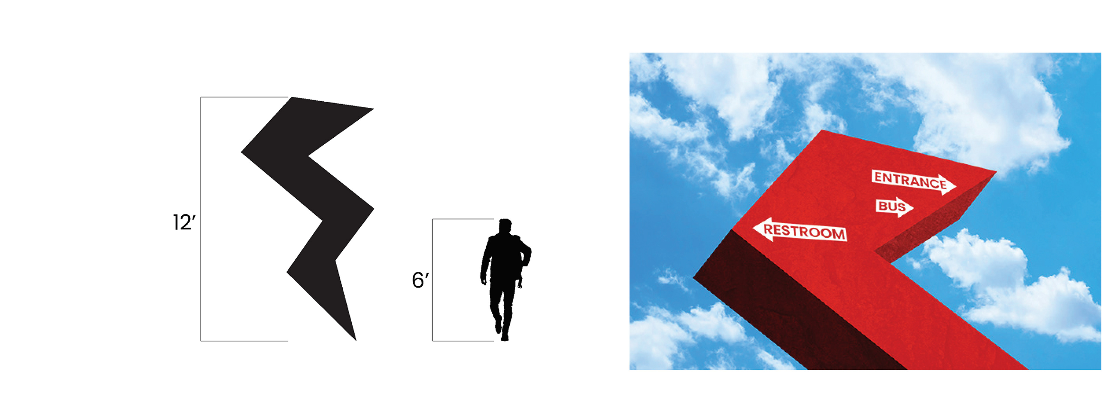
WAYFINDING
Monumental, color-coded signage and sculptural beacons act as navigational anchors and recognizable meeting points. Color and icon consistency improve clarity in the large, high-energy festival environment.
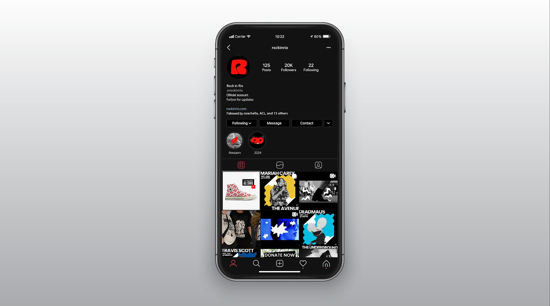
MOTION AND DIGITAL
Created dynamic stage-screen animations that elevated live performances and developed social media assets for a unified brand presence. Designed Rock in Rio app UI concepts with wallet ticket integration, custom schedules, and cultural explore pages.
COLLABORATION
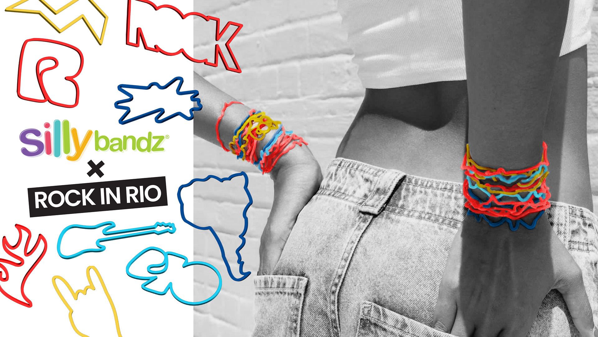
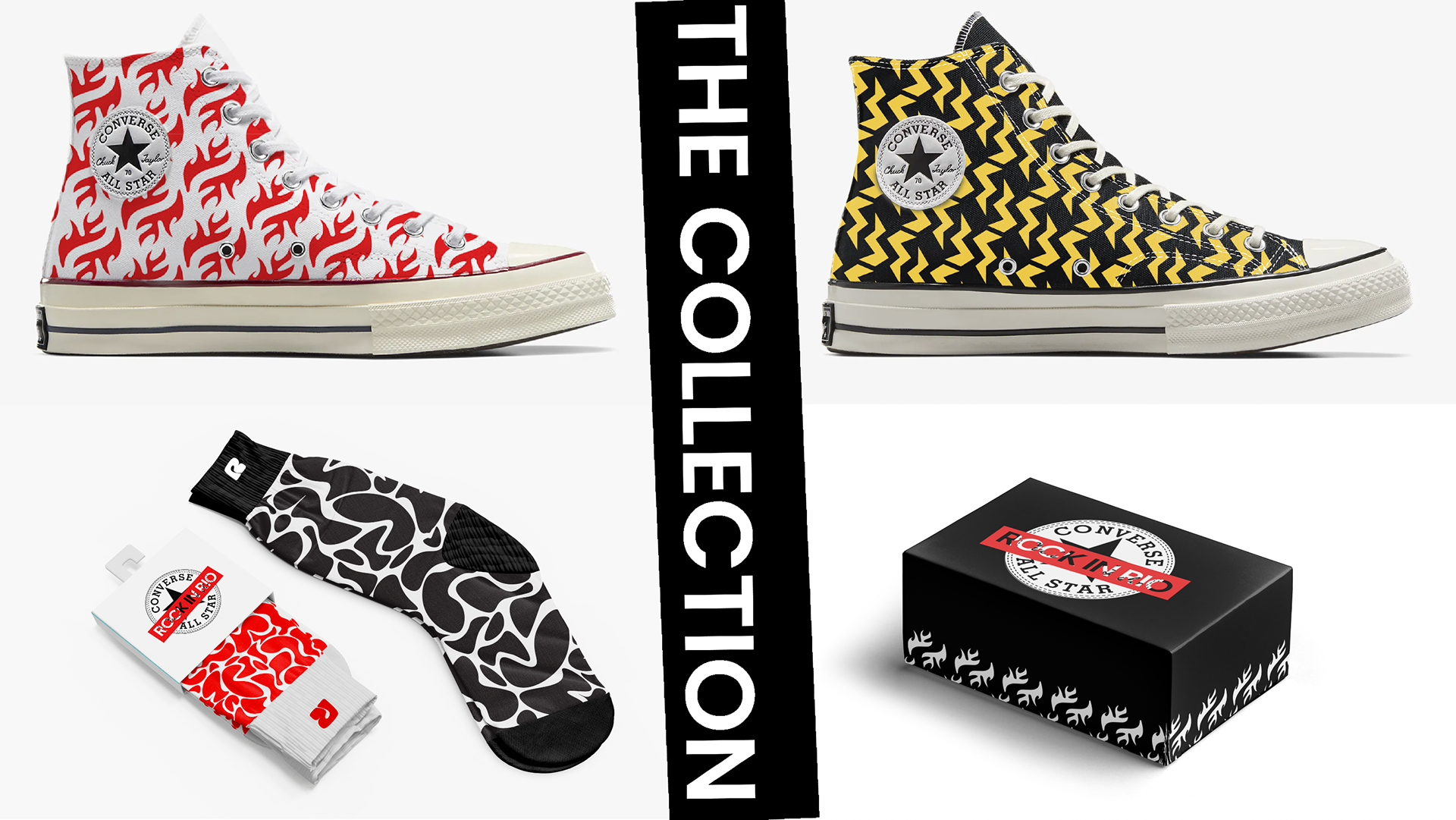
Concepted Rock in Rio × Converse (inspired by the festival’s giant sneaker sculpture) and Rock in Rio × Silly Bandzfor nostalgic, collectible festival culture extensions.
SUSTAINABILITY
Sustainability was integrated into both the visual identity and the on-site festival experience. Building on Rock in Rio’s existing eco initiatives
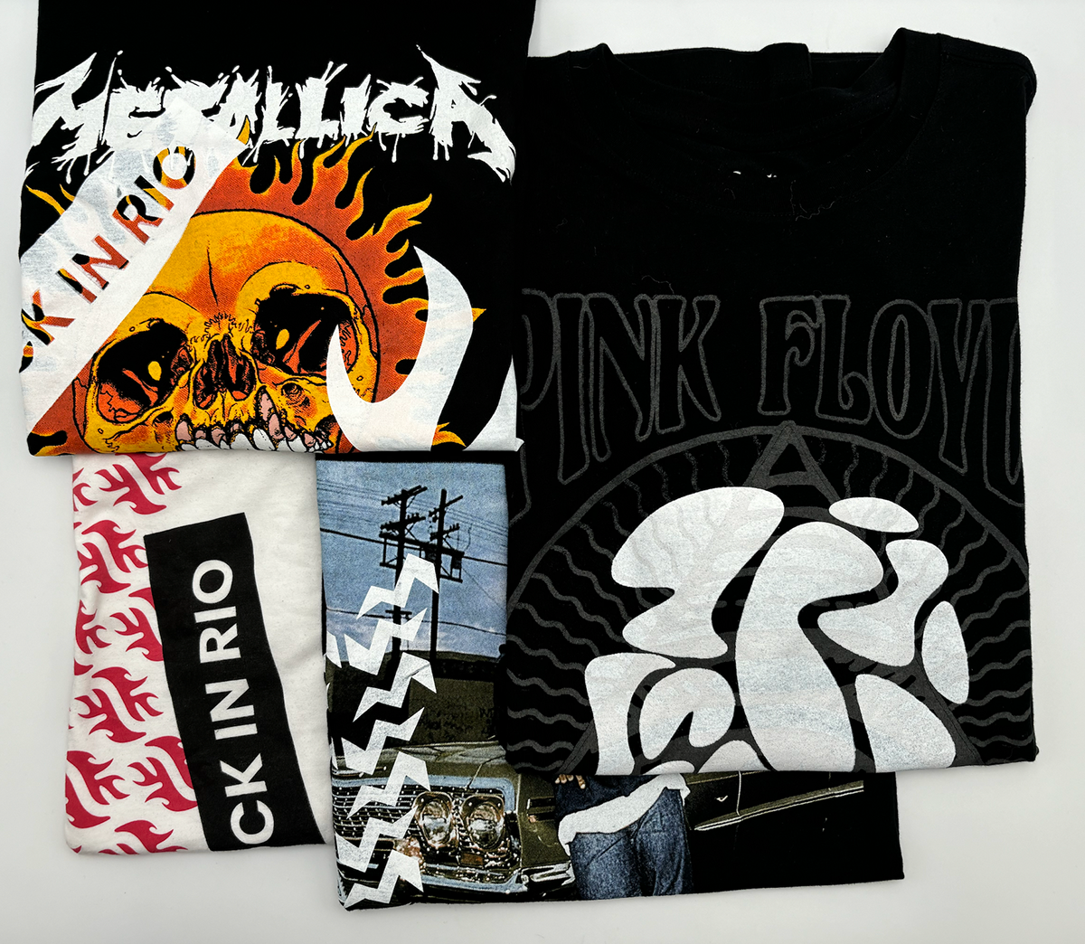
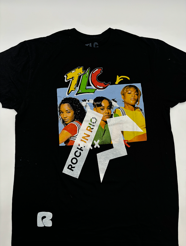
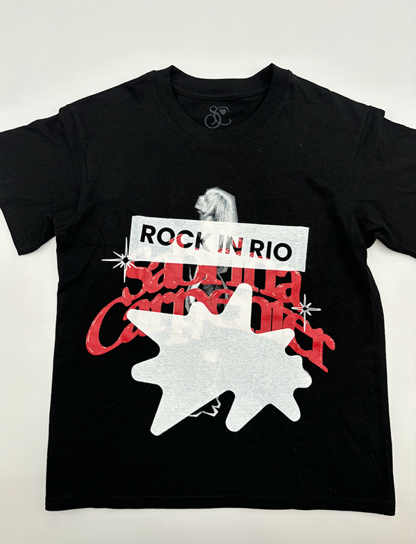
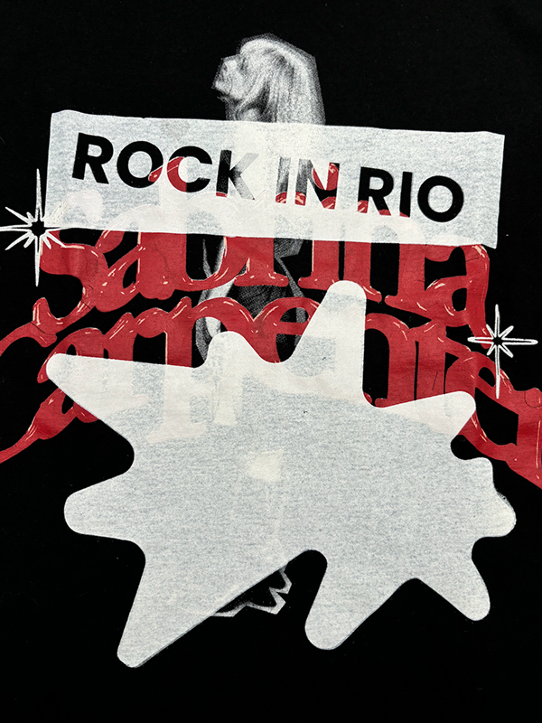
Live Screen-Printing Stations: Festivalgoers could bring their own shirts, whether Rock in Rio–branded or not, to be reprinted with fresh designs, cutting down on textile waste while creating a personalized keepsake.
Reusable Merch Program: Adapted merchandise designs to work on pre-owned garments sourced from local textile recycling partners, reducing production of new apparel and promoting circular fashion practices.